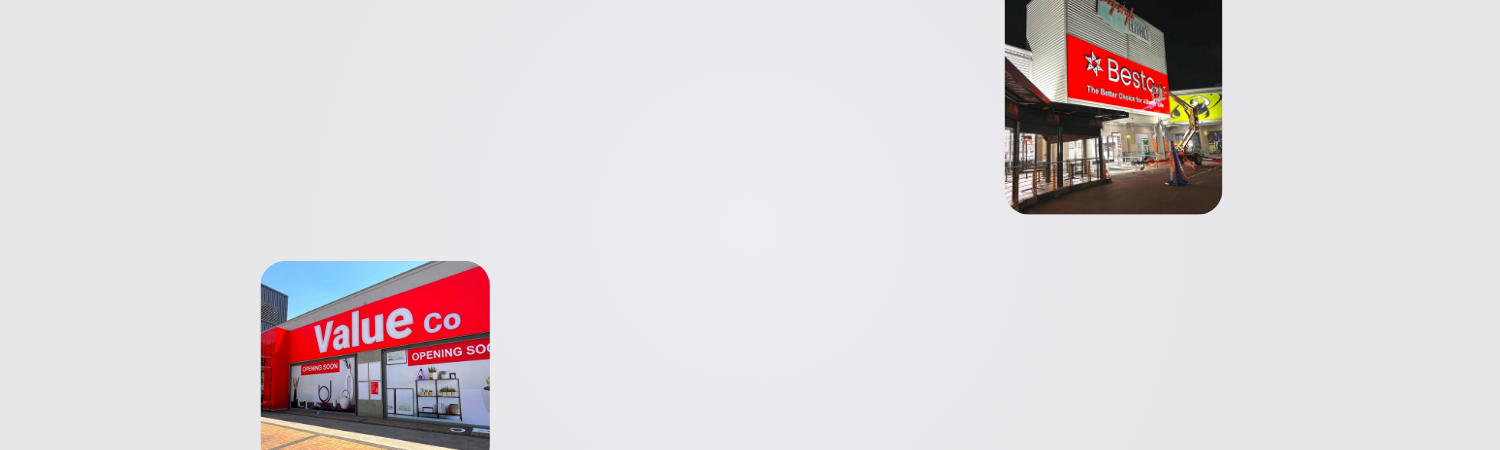

Your business sign is more than just a way to display your company name. It serves as a powerful marketing tool that helps attract customers, build trust, and communicate your brand message.
One of the most common mistakes businesses make is overcrowding their signage with too much information. While it may be tempting to include everything, the most effective signs are often the simplest.
So, what information should you include on a business sign?
Let's break down the key elements.
Start with Your Business Name

Your business name should almost always be the most prominent feature on your sign.
Customers need to quickly identify:
• Who you are
• What business they are looking at
• Whether they have arrived at the correct location
Your company name should be clear, easy to read, and positioned for maximum visibility.
For many businesses, this is the single most important piece of information on the sign.
Include Your Logo

A logo helps strengthen brand recognition and creates a more professional appearance.
Benefits of displaying your logo include:
• Improved brand awareness
• Increased credibility
• Better visual consistency
• Stronger customer recall
A well-designed logo often communicates more about your business than words alone.
Clearly Communicate What You Do

If your business name doesn't clearly explain your services, consider adding a short descriptive phrase.
Examples:
• Custom Signage Solutions
• Property Management Services
• Vehicle Repairs & Maintenance
• Commercial Construction Specialists
This helps potential customers immediately understand your offering.
The key is to keep the message concise and easy to read.
Add a Strong Call to Action When Appropriate

Not every sign requires a call to action, but promotional and advertising signs often benefit from one.
Examples include:
• Call Today
• Visit Our Showroom
• Get a Free Quote
• Shop Now
• Book an Appointment
A clear call to action encourages customers to take the next step.
Display Contact Information Carefully

Whether contact details should appear on a sign depends on the sign type and viewing distance.
For example:
Suitable for Contact Information
• Billboards, Pylon Signs, or Building Signs">Billboards
• Promotional signage
• Vehicle branding
• Event signage
Often Unnecessary
• Building signs
• Shopfront signs
• Reception signs
If you include contact details, prioritize:
• Phone number
• Website address
• Email address (when relevant)
Avoid overwhelming customers with excessive information.
Consider Including Your Website

A website address can be highly valuable because it gives customers a way to learn more about your business.
Benefits include:
• Increased online traffic
• Easy access to information
• Improved customer engagement
Keep the website address short and easy to remember whenever possible.
Use Readable Fonts
The information on your sign is only effective if people can read it.
Choose fonts that are:
• Clear
• Professional
• High contrast
• Appropriate for viewing distance
Avoid overly decorative fonts that reduce legibility.
The goal is communication, not complexity.
Prioritize Visibility Over Quantity
One of the most important rules of sign design is that less is often more.
Customers usually have only a few seconds to absorb information.
Focus on:
• Business name
• Logo
• Key message
• Essential contact details
Every additional piece of information competes for attention.
Match the Sign to Its Purpose

Different types of signage require different information.
Building Signs
Typically include:
• Business name
• Logo
• Brand colours
Office Signage
May include:
• Department names
• Room numbers
• Wayfinding information
Pylon Signs
Often include:
• Business names
• Tenant listings
• Directional information
Billboards
Usually focus on:
• One key message
• Branding
• Contact information or website
Understanding the sign's purpose helps determine what information should be included.
Common Mistakes to Avoid
Many businesses reduce the effectiveness of their signage by making avoidable mistakes.
Too Much Text
Large blocks of text are difficult to read quickly.
Small Fonts
Important information becomes ineffective if it cannot be read from the intended distance.
Poor Colour Contrast
Low contrast makes signs harder to see.
Multiple Messages
Trying to communicate too many things at once can confuse customers.
Inconsistent Branding
Signs should align with your overall brand identity.
Avoiding these mistakes can significantly improve sign performance.
What Makes a Good Business Sign?

The best business signs are:
• Clear
• Visible
• Professional
• Brand-focused
• Easy to understand
A good sign quickly answers three questions:
-
Who are you?
-
What do you do?
-
How can customers engage with you?
When customers can answer these questions within seconds, your signage is doing its job effectively.
Why Professional Sign Design Matters

Designing effective signage requires more than simply adding text to a board.
Professional sign designers consider:
• Viewing distance
• Traffic speed
• Brand identity
• Colour psychology
• Material selection
• Placement strategy
These factors work together to maximize visibility and customer engagement.
Create Better Business Signs with Millennium Signs

At Millennium Signs, we help businesses create custom signage solutions that communicate clearly and deliver results.
From building signs and office signage to pylon signs, billboards, illuminated signage, and retail branding solutions, our team designs, manufactures, and installs signage tailored to your business objectives.
With more than 30 years of experience serving Johannesburg, Gauteng, and businesses throughout South Africa, we understand what makes signage effective.
The right business sign doesn't need to say everything—it simply needs to say the right things in the right way.